Musician Corey Taylor‘s first foray into comics nears its conclusion with House of Gold and Bones #3. The first two issues left something to be desired. Is the newest issue any better? Check out the description from Dark Horse:
An angry mob of zombielike men and women called the Numbers are inches away from capturing the Human. He must find his way to the location of the Conflagration—an event that he is inexplicably tied to—and come face to face with his past if he hopes to escape this twisted new reality!
 This review contains SPOILERS (maybe)…
If you read the first two issues of this series, where an unknown man wakes up in a nightmarish world where everyone seems vaguely familiar, what was your first guess about what was going on? I know I was pretty sure of what I thought the big reveal would be, and, while the specifics are still uncertain, all signs point to me (and most likely you as well) being right. I mean the sign part literally, because a not-to-subtle clue in this issue involved our Human running by a theater marquee with the world “DREAM” in huge letters.
It’s possible that I’m wrong in my speculation, but that doesn’t change the fact that House of Gold and Bones has now spent three issues being unoriginal. It’s okay to use tropes; everybody does. That’s how they became tropes. But you have try to do something unique with it – to distinguish yourself – fast.
Predictability and familiarity are hardly House‘s only problems. Often, when a writer wants to give a story a chaotic, out of control feel, they’ll add random elements, with slightly out-of-sync dialogue. The best writers actually work much harder to create this lack of order. Others just fling material at the page, and, as with House #3, it shows.
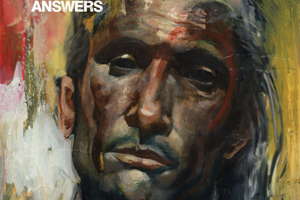
Richard Clark‘s art is decent, but it’s lost the little something special it had back in the first issue. Just like the writing, the pencils are off in places, and it’s difficult to tell if it’s intentional or not, although I tend to think not. Doing something poorly rarely gives any impression other than that the thing was poorly done. The Human, in particular, often appears both flat and twisted. It’s not a good look.
It’s summer, and there are a whole heap of great books appearing. Put your money toward one of those instead of this.
2/5
Speaking of bones, Zac’s feels like they are made of glass. Follow him on the twitter.






S#!T Talking Central