Glory #28 Review


 With a better focus on the art and setting, Glory #28 opens up more to new readers, whilst still giving dedicated followers a lot to read and look forward to.
The official description from Image:
“DESTROYER,” Part Three
Mont St Michel is on the brink of annihilation. Riley Barnes is in the hands of the enemy. Gloria West is on the verge of death. All of it’s Glory’s fault and only her friends can stop her. All this plus the face smashing introduction to the newest, most deadliest member of the Extreme universe!
The plot itself continues from the cliff hanger of the last one. Whilst its still not a great jumping on point for any new readers, it is still easy enough to understand the basics. The universe of Glory is interesting, unique and simply looks  amazing; its a shame new readers might not understand just what everything is.
Yet its still a good issue in terms of narrative. Whilst there is still a lot going on, its less convoluted. Its a lot easier to understand and get behind, moving things at a nice and steady pace. Like the previous issue, it also ends on subtle cliffhanger, suggesting more development or back story.
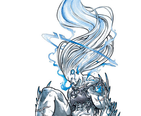
The artwork is also improved upon this issue. Like the previous issue, the art style is simply beautiful, colorful and full of eye-catching design work and detail. However, this is often offset by the thick line art; this is a problem in the more complex and detailed battle scenes. Yet, the action sequences here are a big improvement, there’s less confusion, as well as larger panels, making better use of the fantastic art. With a few full page splashes, Glory #28 makes the most of what it has to offer.
In terms of paneling, Glory #28 sticks to a very rigid, organized layout. It does attempt to defy the 90 degree corners at one point; I almost wish it would do this more often, as it makes the fight sequences look far to organized and civil.
Likewise, there’s one panel in particular that shows the passion and character of Glory perfectly, inter-cutting a large fight scene with a black and white background. Its subtle, yet instantly makes an impact. I’m always a fan of titles that get the message across without needless dialogue, and Glory #28 executes this well.
In short, Glory #28 shows all the strengths of the title, taking its rich, unique setting and making the most through stunning visuals. If you don’t mind being a little confused, new readers are sure to find lots to love.
4/5


S#!T Talking Central